 |
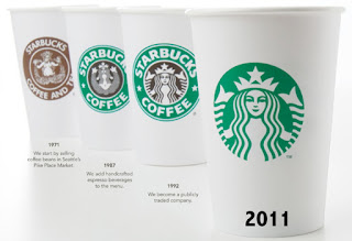
| Starbucks' logo changes through the years |
even if I'd seen either of the two previous logos, I still don't think I would have thought it was a mermaid; I never knew they came in a double-tailed version until I saw this picture and read the explanation.
I'm not insulted by the 1970's logo with the bare-chested lady, considering the nautical nature of the logo, but it was a bit distracting the first time I saw it. That is, I'm sure, why the logo was changed to the more cartoon-ish, non-chesty variation.
The Problem with the New Logo
In terms of staying with the general theme, Starbucks has done a good job; the main character is still there, but her black background is gone, so she doesn't seem to stand out like she used to do. Also, the complete absence of the company's name seems both naive and pretentious all at once. To assume that people will automatically recognize the mermaid as part of the brand seems like a stretch.
When I looked at it again, it screamed, "Cost savings!" With the absence of the black color, Starbucks has decreased its printing costs considerably, and in the current economic environment, it might have seemed like a genius idea. I can imagine the executives sitting in a room trying to hash out a plan to save money, throwing out any possible idea, when the assistant to one of the execs looks up from his calculator and shouts for joy!
"We can save ten million dollars by getting rid of one of the logo colors!"
At first, they probably looked at her like she was crazy, until she explained what to do. Then they all probably cried, "Eureka!" And they probably HAVE saved a boatload of money on printing, since they have about a billion stores stocked with thousands of cups in various sizes.
The Take-away
Be careful when changing your logo; if it's too much of a disconnect, people will be confused. Sometimes consumers lash back, too. Next time, we'll talk about the most recent example of customer angst: Gap.

Good post. I wonder what huge Starbucks fans have to say about the recent change. It obviously hasn't been as big of a deal as the Gap incendent from late last year, but I'm sure there's some chatter out there somewhere.
ReplyDeleteThere has been chatter. I've heard that it's Starbuck's mid-life crisis, but most are waiting, with a sense of mild foreboding, to see what happens.
ReplyDelete